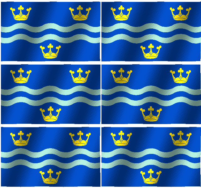
The Cambridgeshire flag was created by Brady Ells and registered on February 1st 2015, the day it was announced as the winning design in a competition held to select a flag for the county. The competition was organised by adventurer and campaigner Andy Strangeway in conjunction with the Flag Institute and endorsed by several local authorities. Several local councillors formed a judging panel which sleected six finalists from the initial submisisons. The design features three gold crowns representing East Anglia, in which Cambridgeshire is located. These sit on a blue background which is the same shade used on the East Anglia flag. The wavy lines represent the River Cam and are in the colours of Cambridge University.
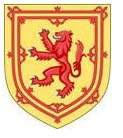
Cambridgeshire had borne no distinct emblem such as the Stafford Knot or white Yorkshire rose. Arms borne by administrations in the county tended to be Scotland’s royal arms because of the Scottish Crown’s posession of the Earldom of Huntingdon and Cambridge in the Middle Ages – a somewhat tenuous linkage and arbitrary choice for emblems to represent the county.
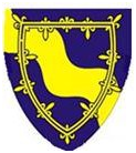
The original Cambridgeshire County Council bore arms created in 1914.
which included a broad wavy diagonal division of the shield, symbolic of the River Cam and its trade and the lkarge number of water ways that crossed the county. Also on the arms was a gold double tressure as found on the Scottish royal arms,
was included in token of the royal Scottish connection as described.
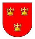
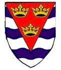
The territory of Cambridgeshire was originally jointly administered with an “Isle of Ely County Council” in token of the Diocese of Ely that had existed in the locality until 1837 and the council bore arms that were derived from the diocesan arms
The gold crowns crowns were retained in the Ely council’s arms, along with white and blue wavy lines, indicative of the abundant local waterways, found in this territory termed an “isle”.
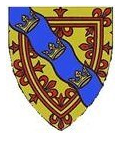
In 1965 these two administrations were merged and received a new set of arms created from elements found in the previous arms.
The wavy stripe was now blue, more appropriate for a representation of water, with the three ducal crowns placed along its length. The new shield looked even more Scottish as it was now gold with the double tressure in red, as in the Scottish royal arms, shown above.
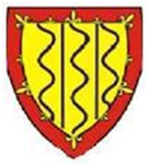
Further re-organisation in 1974 led to the creation of yet another set of arms.
The Scottish tressure was modified so that it appeared as a red border. Wavy blue lines represent the many rivers of the county whilst straight ones (pallets) symbolis the drains and dykes of the Fenlands.
Such representation of the county’s watercourses has been a persistent theme and one that was taken up again in several of the submissions to the county flag competition, including of course the above winning design.
